Derbygirls Blog has been featuring guest posts by derby girls about what drew them to the sport initially and what keeps them in it. This post by Rachel MadHo about being queer and a derby girl stood out to me in particular, especially this part:
“Within the derby community, minority though I may still be, I am neither invisible nor spectacle. I can’t think of another context where being a minority does not mean being in the margins. My difference, my queerness, is known and acknowledged—yet I am not treated like the Other. Most of my leaguemates see the real me, and appreciate instead of gawking. They get it. Even the straight ones.
“Because, I think, there is a queerness about rollergirls—whatever their gender preference in partners. There is an understanding that as women, the world we’ve been given and the roles we’ve been assigned aren’t quite right, don’t quite fit. There is a determination to do things differently, to in fact do everything we aren’t supposed to do: act out, speak up, take up space, know ourselves and be true to ourselves, own our sexuality and whatever it means to us, fight for what we want instead of accepting what we get, always have each other’s backs.”
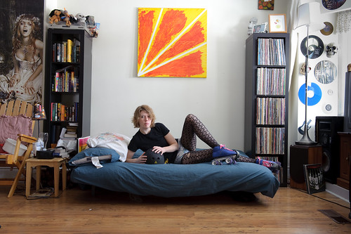
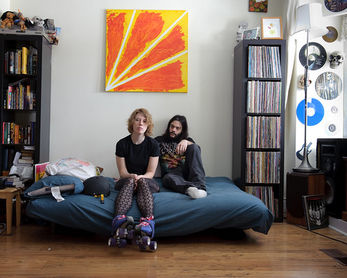
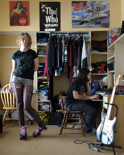
A day or two before that post showed up in my reader I was just remarking to myself that my latest images are feeling awfully heteronormative to me, and I don’t want that. So at some point I’m going to have to seek out queer derby girls. It feels a bit mercenary but I think it’s important to include that perspective.
* * *
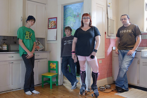
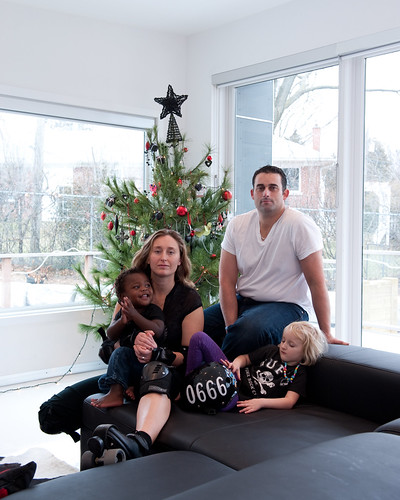
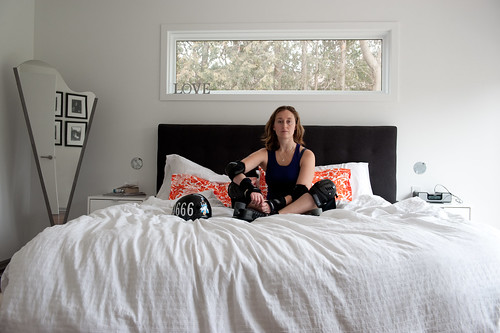
I’ve been working on editing my show coming up in March. Editing is HARD. Especially with this derby girls series, where I have some definite ideas I want to get across. I find myself getting attached to particular items in a derby girl’s home, and I want to use the images with those things in them even if they don’t really work. I can’t seem to get any distance from the things… is there a word for inappropriate attachments to things? To give you a few more examples, I’ll start with Lawna Mower who I photographed a week or two ago:
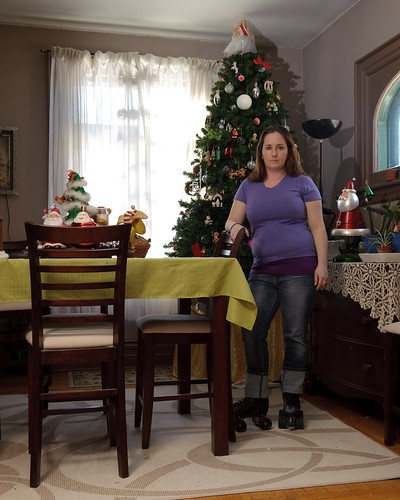
I love the Barbie/pageant winner topping her tree. But I wish I’d chosen a better height for my camera because I’m pretty sure nobody else’s eye will go there. And there’s too many angles for my taste.
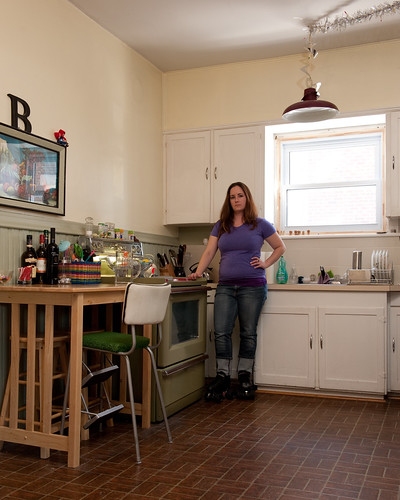
I love the tinsel on her light cord, the repeating lines of the plates in her dish rack and the vintage high chair. But they’re all a little too far apart and too close to the edge of the frame. (I’m constantly crushing myself into corners to try to fit stuff in…)
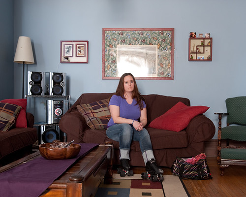
This is probably the best picture from the shoot. The light was nice, but the only thing I was attached to was her green toille (?) curtains, which I couldn’t fit in anyways. What to do?
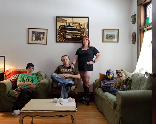
Of the images you’ve seen before, I offer these confessions.
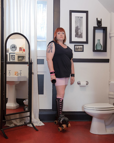
I LOVE Suzy Slam’s candle. Is there a name for that gesture? (I also love her socks!) But I think she’s just a little too centred in the frame somehow.
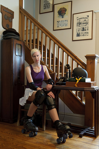
Baroness von Spike’s husband is a famous cartoonist and I just loved seeing the word Gynecology on the wall. But do you even notice it?
Hey! Maybe you can help me out. Will you tell me if you even noticed the things I love? That might be a first step to letting go.
Anyways, editing is HARD. I wish there were resources to help, but I haven’t seen any. Don Weber and Alec Soth are both great editors, imho, and they’ve both helped me, but I’m pretty sure it’s such an intuitive thing you can’t really teach it.
