Mish Mash

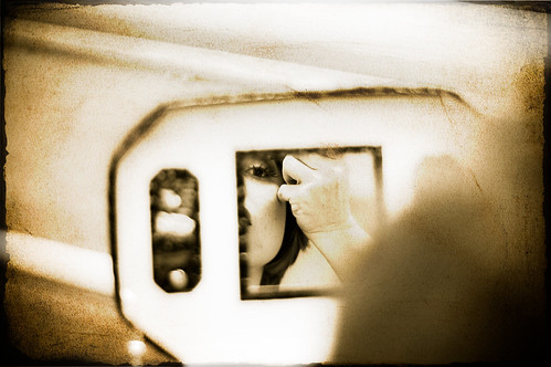
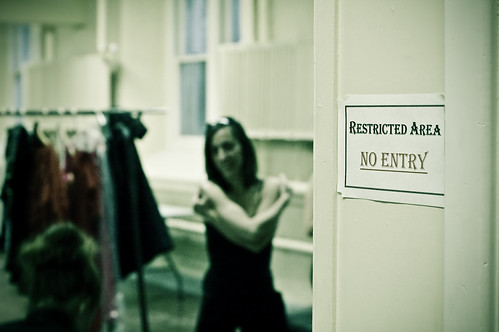
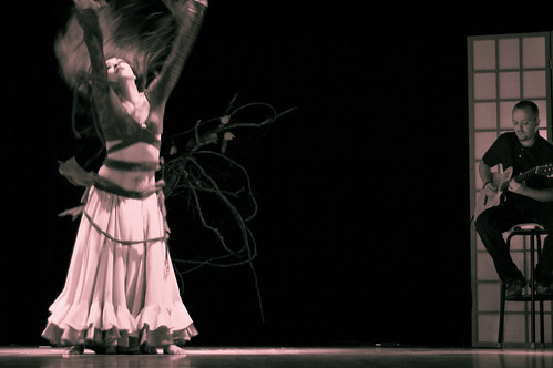
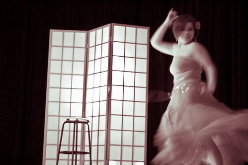
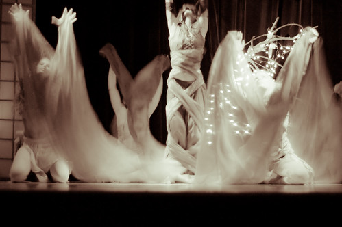
Last Saturday, I photographed the sixth annual Mish Mash Belly Bash hosted by Invoketress Dance. When Ishra saw my photos from her student recital last June, she asked me to photograph the Mish Mash, and I jumped at the chance. I shot a lot of material and I’m still sorting through it, but here are some of my early favourites.

From backstage and the afternoon rehearsal:
closing curtain2

minerva backstage

no entry2

From the show:
ishra2-2

voi2

minerva2

djins
From the closing number, the dance of the djins, in which the central dancer is possessed by djins or demons.

djins3

Please vote for me at the Canadian Blog Awards. Saturday is the last day to vote in round 1.

Calendars now available!

Good news! My calendars are now available for sale. There are four to choose from: South Africa, Parking Meters in Lunenburg, Cuba, and Guelph. Click the pictures below to go to redbubble to see previews of every page. They’re priced at $28.50 CAD, and because Christmas is coming, I’ll donate all the proceeds from any calendar sales to the Stephen Lewis Foundation instead of my usual 50 percent. That means $9.50 from every calendar.

buy South Africa calendar from peripheral vision

buy Parking Meters in Lunenburg calendar

buy Cuba calendar from peripheral vision

buy Guelph calendar from peripheral vision

Don’t forget to vote for me at the Canadian Blog Awards!

Nomination!

My calendars aren’t ready yet – sorry. But I do have news. This blog was nominated for a Canadian Blog Award in the category of Best Photo/Art Blog. So please go vote, before November 30.

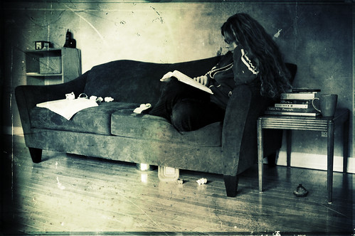
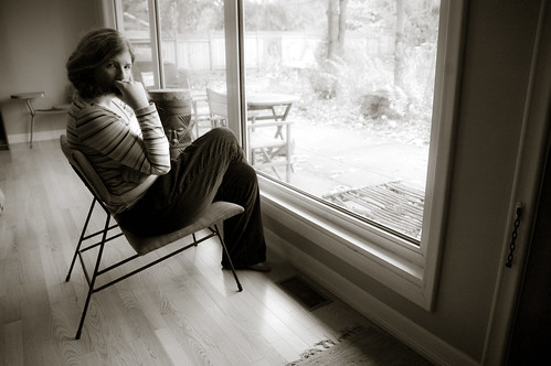
In the meantime, I’ll leave you with a couple self-portraits I made last week.

self, reading
why my house is so messy

braid

25% off custom framing

Just wanted to let you know that Imagekind has a new promotion: 25% off custom framing until 10 pm PST on November 20, 2008. Just enter the code HOLIDAYART08 when you check out.

Coming Soon: 2009 Calendars!

I’m working on creating four calendars for 2009. Hopefully this week I’ll be able to put them up for sale.

I’ve decided to use redbubble for my calendars. There are lots of options for calendars out there, but I chose redbubble because I think the quality is the best. And I really don’t think it’s in my interest to have poor-quality stuff out there. I figure redbubble is looking to fill the art niche, and all the reviews of I’ve read of its calendars are enthusiastic.

Cafepress’s website was totally un-intuitive to use, and I ended up having to create my test calendar twice. I wish Imagekind made calendars, because I love being able to just import my images from flickr, titles, tags and all. Redbubble’s site is pretty handicapped because as far as I can tell, you can only upload images one at a time, which is a REAL pain in the ass.

I’m a bit concerned about pricing my calendars. Redbubble’s base price is $19 CAD. My first thought was that this is way too high. Who’s going to buy a calendar for more than $20 plus shipping when you can pick up any old calendar for $15? And that would leave me virtually no profit to donate. But then I thought about how my prints start around $20, unframed, and go up depending on the paper and size.

It seems to me that if the images are reproduced well on good paper, a calendar is like buying 12 unframed prints, and getting to look at a new one every month. Or like hanging pages from a photo book on your wall. Now THAT is worth more than $20 to me. So I’m pricing my calendars at a 50% mark-up, which sets them at $28.50 CAD. That leaves between $5 and $9.50 for donation. So stay tuned for calendars…

The Writing Life

I picked up The Writing Life by Annie Dillard yesterday. I didn’t expect it to have anything worth mentioning on this blog, but here I am four pages in, and already proven wrong.

“Every year the aspiring photographer brought a stack of his best prints to an old, honored photographer, seeking his judgment. Every year the old man studied the prints and painstakingly ordered them into two piles, bad and good. Every year the old man moved a certain landscape print into the bad stack. At length he turned to the young man: ‘You submit this same landscape every year, and every year I put it on the bad stack. Why do you like it so much?’ The young photographer said, ‘Because I had to climb a mountain to get it.’”

thinking about overlays and textures

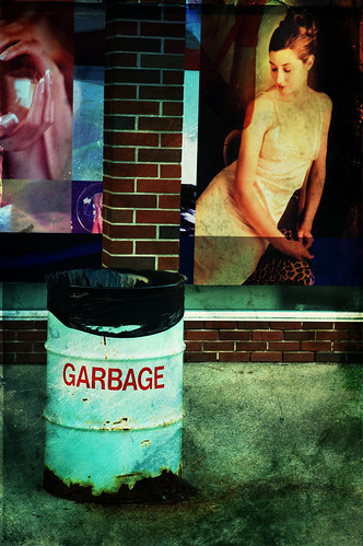
garbage and mural

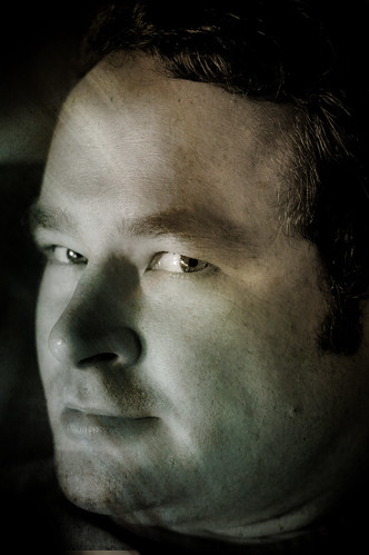
A couple of weeks ago, someone whose opinion I respect described my photos as painterly. She went on to say that I apply the overlays with a very aesthetic consideration. I got the sense that she’d *heard* about the trend of using overlays but that she’d written it off as a fad, that she’d never thought it might have aesthetic value. Until she saw my pictures. I took it as the compliment I’m quite sure she intended, but the word painterly bothered me.

Somewhere, some time ago – I can’t remember when or where – I heard or read someone say that they don’t put much effort into trying to explain their photography. That’s the critic’s job. The photographer expresses him or herself visually, not verbally. What a relief that was for me! It gave me permission to stop pressuring myself to explain everything. That said, I think it’s important to question myself, to explore my intentions, and to challenge myself. I try to use discomfort as a signal to look at something more deeply.
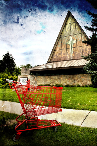
church and cart

I’ve never set out to make a photo painterly. I very much agreed with David Hurn in the summer who said photos should never attempt to be painterly because paintings will always do it better. I didn’t make note of that comment in my post about the Contact Festival, but he said it and I still remember it.

So what *have* I been trying to do with all these overlays?
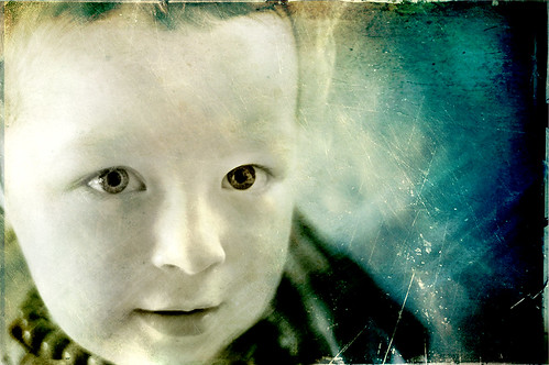
eyes

My initial thoughts on the subject were that overlays introduce an element of spontaneity to the post-process. It’s all about trial and error, and some overlays change the lighting in an image and bring focus to an area previously ignored. I mostly just thought they looked cool. I don’t use overlays on all my images, although sometimes it’s just because I couldn’t find the right overlay for the image. That said, I’m not at all tempted to use overlays on my portraits from the drop-in centre – I wonder why? I think that may be a question for another post.

When I apply an overlay, I think I’m trying to make the image look old and worn or damaged. I’m trying to call attention to the edges of the frame, to push the contrast and distort the colour ranges beyond the plausible. I can see how someone might see the effect as painterly; I do want to make it look less real, I think, more processed, although I’d hate for anyone to see them as anything other photos. Why? Is that contradictory? I wonder if I’m trying to emphasize the fallibility of any single image? To challenge the expectation that photos carry capital-t Truth? I don’t believe there is such a thing as Truth, only a plurality of truths.
eyes2

What do you think? If you’re a photographer, what kind of effects do you use in your work and why? If you’re a viewer, what do you think of images with overlays? Do you react differently to them than to less processed images?
tattoos and body paint

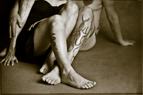
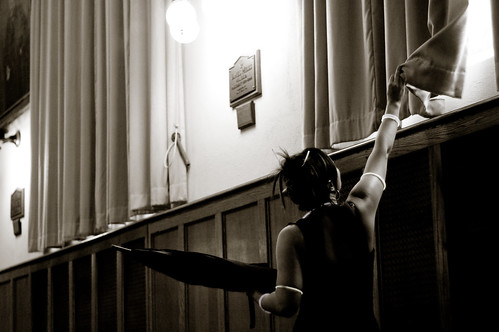
I’m not sure if I’ve mentioned this already, but I’m taking a continuing photo class with Trina Koster. The people I’m meeting are great, and I get to shoot things I probably wouldn’t otherwise. Last week, she brought in two beautiful, tattooed models and some body paint supplies. I have to say, I’m not sure the body paint thing really worked — I mean, that’s a whole other skill! But it was certainly an interesting exercise. And Sue and Yves had lots of tattoos so we could photograph some without body paint. Here are a few of my favourites from the shoot:

arms

intwined

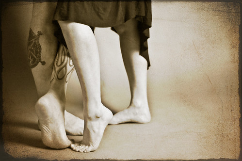
feet

I think this one is my absolute favourite of all:
palm leaves2

Sue and Yves were so generous, there are A LOT of other shots I like, which you can view in a slideshow.